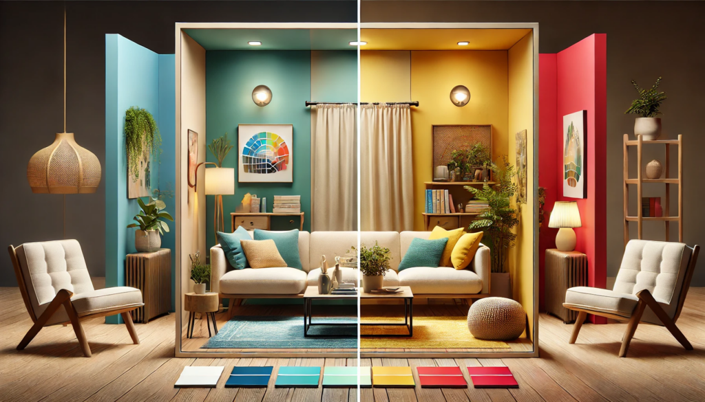
The interplay of colors in interior design does more than just beautify a space; it evokes emotions and sets the mood. Understanding color psychology is crucial for creating atmospheres that not only reflect personal style but also enhance well-being. Incorporating the right colors into a design scheme can transform a space from simply aesthetic to emotionally resonant, creating a home that not only looks beautiful but feels right.
Color Psychology of Tranquility and Serenity
Blue, often associated with the sky and sea, promotes calmness and relaxation. Lighter shades like sky blue can make a room feel airy and soothing, while darker shades like navy offer depth and stability. This color works well in bedrooms and bathrooms where you seek tranquility.
For Harmony and Renewal
Green, reminiscent of nature, helps in creating a serene and restorative environment. Its color psychology is known to reduce stress and is ideal for spaces where peace and restoration are priorities, such as living rooms and study areas. Olive greens and muted sage are perfect for a subtle, earthy feel.
For Energy and Optimism
Yellow captures the essence of sunlight, bringing a sense of optimism and energy to any space. It’s a great choice for kitchens and dining areas where a warm, welcoming feel is desirable. However, it’s best used in moderation, as too much yellow can be overwhelming.
Color Psychology of Passion and Appetite
Red is a powerful color that can stimulate both emotions and appetite. Designers often use red in dining areas and kitchens to evoke warmth and energy. However, due to its stimulating nature, it is best to use red as an accent color to avoid overpowering the space.
For Luxury and Creativity
Purple has long been associated with royalty and luxury. Lighter lavenders can be calming and are excellent for bedrooms, while deeper purples bring a touch of drama and sophistication, suitable for living rooms or offices.
Social and Inviting Color Psychology
Orange is a blend of red’s passion and yellow’s joy. It creates a friendly and welcoming atmosphere, making it a great choice for living spaces and children’s rooms. It encourages interaction and is thought to stimulate creativity.
For Purity and Simplicity
White can make spaces feel larger and more open. It offers a clean aesthetic but can also be paired with any color to create balance and allow other colors to pop. This color psychology is ideal for small spaces or as a base in minimalist designs.
Color Psychology of Sophistication and Depth
Black adds sophistication and depth to any space. It’s particularly striking when used in contrast with brighter colors. In moderation, black can help define a space and highlight other colors or elements within a room.
For Neutrality and Balance
Gray is the quintessential neutral. It pairs well with nearly any color, providing a backdrop that allows other colors to shine. Light grays can soothe, while dark grays add dramatic flair, making it versatile for both corporate and personal space
KlugKraft is the premier online destination for system integrators and interior designers to showcase their home & office automation products. This platform is meticulously crafted to highlight the synergy between innovative technology and elegant design. Providing a comprehensive portfolio space for professionals. KlugKraft allows experts to display their latest smart home technologies, from intuitive lighting solutions to sophisticated security systems, all designed to enhance modern living. By offering a dynamic and interactive showcase, KlugKraft not only connects these professionals with potential clients but also sets a new standard in the integration of technology and design in home automation, ensuring every space is as functional as it is visually stunning. KlugKraft (a unit of Smart Group)


